
Triptych of Saint Francis

Specifications
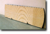
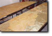
This work is composed of three top shaped double panels ( cm 100x300x7 ea. /in 39.37 x 118.11 x 2.3/4 ea.). The rear side of the panels is black. On the front side, a metal wire net is secured to the surface with tens of long nails, inserted in the wood as deep as only half their length. This preparation was essential to receive and give consistency and stability to many pourings of gesso (plaster) melted and mixed with animal glue.
Once the desired thickness was reached, the gesso was sandpapered, levelled and treated with a sealer to cover its porosity.
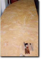
Then the drawing of the whole scene was reproduced from the preliminary sketch, adapting it to the dimensions of the panels.
At this point , the realization of the bas-relief began. This part of the work was particularly laborious, as the gesso,not having the same consistency of the marble, often cracked under the chisel. As a consequence, a remoulding of the interested part was necessary as needed.
The bas-relief was then sealed again and coated with a special adhesive on which, before a complete drying, a very thin layer of brass leaf was applied, giving a real gold look to the whole work. The sky was rendered with enamel paint.

The whole bas-relief was shaded and then "aged", to give a look of antiquity and finally fixed and coated with several glazings of natural shellac.
The letters in the symbol of the Order ("Charitas") are made of brass foil; those ones in the inscription at the bottom
of the triptych ("Francisco Paullano Dicatum" /Dedicated to Saint Francis from Paola) are bronze.
On the whole, it took about one and a half year to complete the work, also due to the long drying times of the many plaster pourings, the sealers, the adhesive,the fixatives, the enamels and the final shellac.
The triptych was commissioned by a well known engineer from Taranto, Mr. Luigi Perrone, who wanted to make a donation to the Franciscan Friars community in Grottaglie.
It was consigned to the monastery on January 26, 1991, and temporarily placed in the refectory, waiting for its final current location after the completion of the monastery restoration works , then in progress and directed by the mentioned engineer.
Preliminary sketch of the Work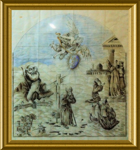
The Work
The Triptych synthetically describes the Saint's life and some of his miracles. In the left panel , from the bottom upwards, a) the prodigy of the flames blazing over Francesco's house roof on his birth day, b) the present monastery dedicated to Him in Paola and c) the first miracle the Saint performed raising a local young man from the dead , are depicted.
A dove, symbol of divinity, is flying over the mountainous landscape of His Calabria.
The central panel is dominated by two great characters: down below the Saint in His most classical and traditional iconographic portrayal, with a big cross right behind Him, as a solid spiritual support, and the Archangel Saint Michael descending from Heaven to consign Him a shining and flaming shield , on which the letters of the symbol of the Minor Friars Order created by Francesco stand out.
In the right panel, again from the bottom upwards, the miracle of the crossing of the Messina strait on his mantle with two accompanying friars is depicted, after a fisherman refused to carry the group on his boat to the opposite shore.
Higher up , Francesco's meeting with the Pope (Sixtus IV) and the King of Naples (Ferdinand of Aragon) before, and of France (Louis XI) after, is ideally represented : the meeting of the minimum devotional reality with the maximum expression of the temporal and spiritual powers. The outline of the towers in the background and of the temple in the foreground symbolize the material expression of such authorities.
The various parts of the whole scene ' are founded' on a sea of clouds, in order to raise the earthly episodes of the Saint's life to a higher dimension, more spiritual, and more consistent with the represented subject.
The clear emphasis on two colors , gold/blue, gives the idea of the pictorial taste of the period, as well as the primitive strokes of the drawing convey the sense of Saint Francesco's essential religious practices.
The dedication "Francisco Paullano Dicatum" ("Dedicated to Saint Francesco from Paola") is placed at the bottom of the panels, and, farther to the right, a little brass plate bears the name of the author of the work (Vincenzo Mariani) and the date of its completion: 1990 (MCMXC)
Current position of the work in the San Francesco di Paola Monastery in Grottaglie (Taranto)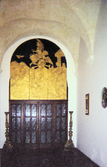
http://www.grottaglieturismo.it/portale/info/id30.asp
The Author
Sacred gold and oriental enamels
In short, the two most typical aspects of V.Mariani's works.
The two main interests which are thoroughly explored in his pictorial activity clearly transpire from the numerous themes and different techniques used by the artist.
In the seeming long time-space distance from the two inspiration sources, some emotional links often join, and sometimes overlap, their motifs: the immediacy of the message, and the rendering of the artistic idea in a very simple and direct way, without any stylistic or passing fads' conditioning.
That is true both in the reproduction of ancient religious themes, where the sacred element is depicted as much realistically as possible for an immediate cultural understanding, and in the bright watercolors, pretty pottery decorations and serious oriental lacquers, thanks to a genuine rapture in front of natural visions (landscapes, birds' flights, flowering trees) and a sincere lyrical purity applied to each artwork.
Several forms and techniques are used: signs and colors typical of the medieval age (San Francesco di Paola's ancona) , of the Russian area (icons) , of the oriental iconography (chinoiseries), all applied with traditional and contemporary media (egg tempera, animal glues, natural and chemical thinners, enamels, gold leaf on gesso and terra cotta) and always according to old procedures.
Some elements and descriptive situations are sometimes rendered in a so very immediate and essential graphic way to be almost perceived as the modern posters or similar contemporary communication means.
*********
Vincenzo Mariani, after completing his university education in Italy, spent a long period in the United States, where he worked as restorer and decorator for some renowned antiques dealers. During that period, also thanks to the collaboration with some oriental craftsmen and the presence of a very large Chinese community (San Francisco), he developed his familiarity with the Chinese art and iconography and their application to furniture and related objects.
At the same time, he also attended commercial design courses and completed a six month stage as a trainee in a graphic design company, thus becoming rather knowledgeable about many aspects of the world of figurative communication.
At present, his artistic production is carried out alongside with his main activity of linguistic consultancy (translations) , Web Graphics and Desktop Publishing.